We, at Get Well® self care didn’t just choose magnetic colors for our Colors of Courage campaign—we chose symbols. Each hue in this collection isn’t merely a shade; it’s a powerful emblem representing a specific health challenge, a beacon of hope, and a call to action. This isn’t about pretty and pleasant packaging; it’s about a profound purpose:
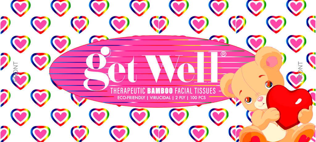
Pink (Breast Cancer): Pink isn’t just a “girly” color; it’s a battle cry. It’s the color of resilience, the soft strength of survivors, and the unwavering hope for a cure. It’s a humble reminder of mothers, daughters, sisters, and friends—a symbol of the ongoing fight against Breast Cancer and the urgent need for continued research and support.
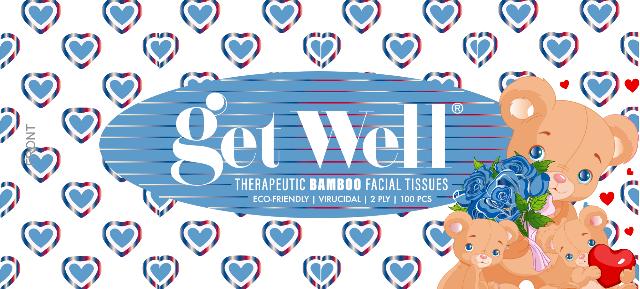
Blue (Diabetes): Blue isn’t just calming; it’s the color of vigilance. It represents the constant management, the daily challenges, and the quiet strength of those living with Diabetes. It’s a symbol of the need for accessible healthcare, education, and a future free from the complications of this pervasive disease.
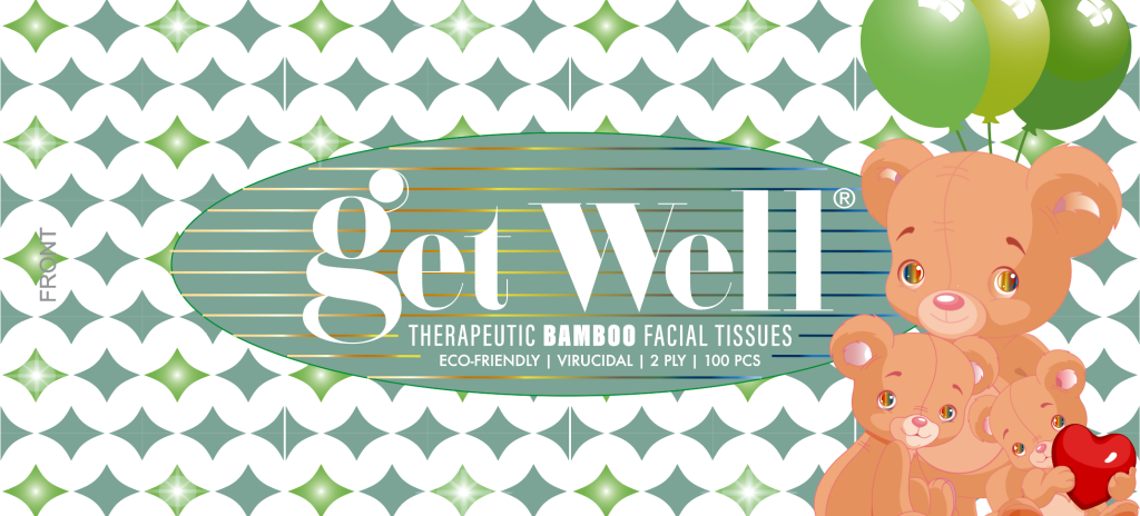
Teal (PTSD): Teal isn’t just tranquil; it’s a emblem of the unseen wounds. It represents the courage it takes to confront trauma, the struggle for mental wellness, and the urgent need to break the stigma surrounding PTSD. Teal is the color of PTSD awareness, a call for compassion and understanding.
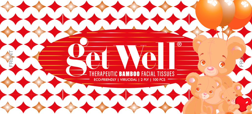
Orange (Leukemia): Orange isn’t just vibrant; it’s the color of fierce determination. It represents the fiery spirit of those battling Leukemia, the relentless pursuit of a cure, and the unwavering support of families and medical professionals. Orange is Leukemia awareness, a symbol of hope amidst a challenging fight.
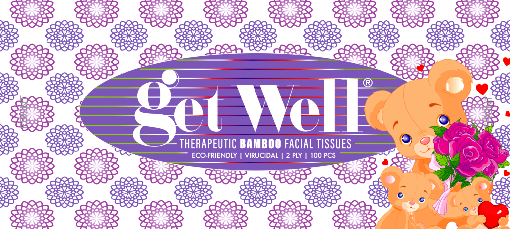
Purple (Lupus): Purple isn’t just regal; it’s the color of complexity. It represents the multifaceted nature of Lupus, the often-invisible symptoms, and the daily struggles of those living with this autoimmune disease. Purple is Lupus awareness, a call for greater understanding and research.
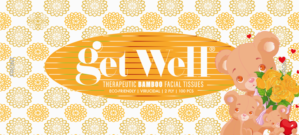
Yellow (Obesity): Yellow isn’t just bright; it’s a hallmark of the complex challenges surrounding Obesity. It represents the need for compassion, education, and accessible resources to support individuals in achieving and maintaining a healthy weight. Yellow is a call for a holistic approach to well-being, acknowledging the multifaceted nature of this health issue.
Get Well® chose these specific colors not as an afterthought, but as a deliberate act of solidarity. They understand that color speaks volumes, that it can ignite conversations, inspire action, and offer a powerful sign of hope.
The Colors of Courage campaign isn’t just about plant-based facial tissues; it’s about standing shoulder to shoulder with those facing these health challenges, offering a tangible reminder that they are not alone. It’s about turning everyday purchases into acts of support, one tissue, one color, one act of courage at a time.